How to Create a Dashboard in Microsoft Dynamics CRM: A Step-by-Step Guide for Enhancing Business Intelligence
Creating a dashboard in Microsoft Dynamics CRM can be a game-changer for your business. I ve seen firsthand how it helps teams stay on top of their data and...
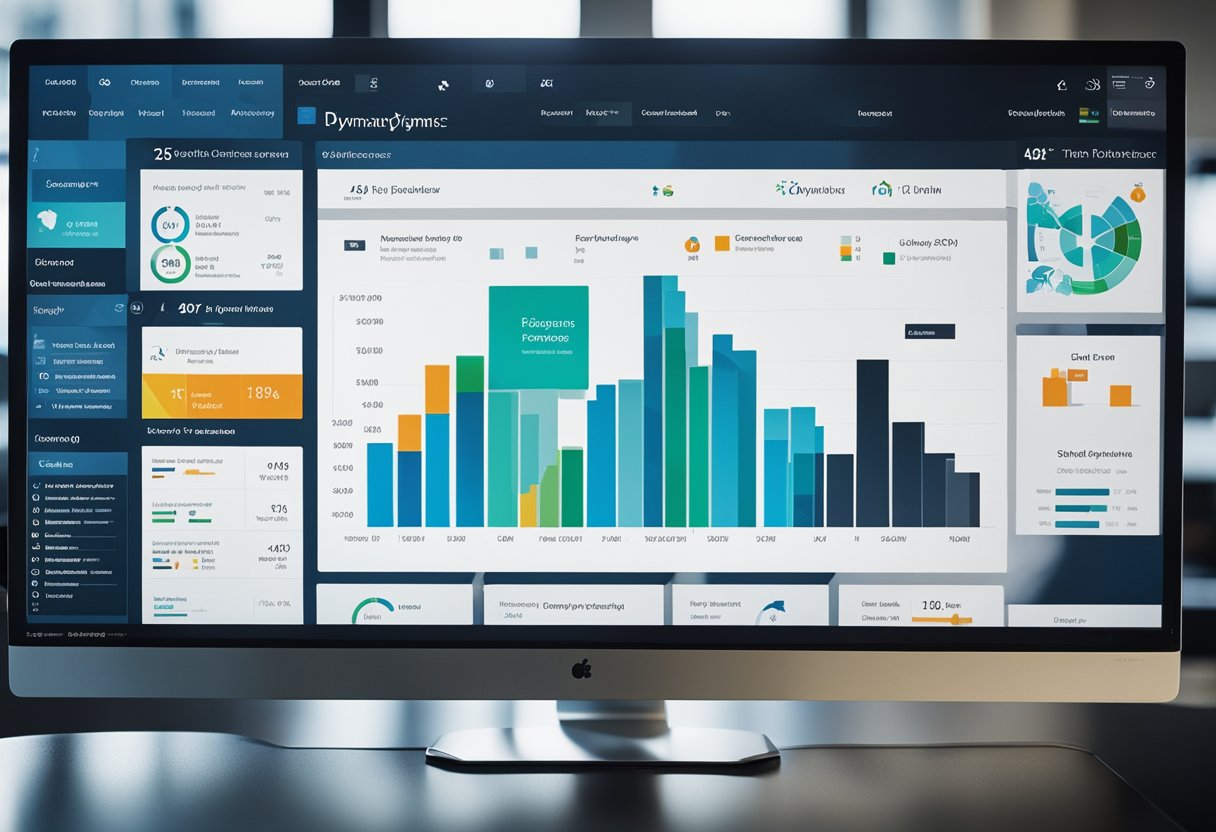
Creating a dashboard in Microsoft Dynamics CRM can be a game-changer for your business. I’ve seen firsthand how it helps teams stay on top of their data and make better decisions. To create a dashboard, you’ll start by opening the Solution Explorer, selecting Dashboards, and then choosing New to pick a layout. It’s a straightforward process that can yield powerful results.
I always tell my clients that a well-designed dashboard is like a control center for your CRM. It puts all the important info right at your fingertips. You can add charts, lists, and other components to give you a clear picture of your business at a glance. Whether you need to track sales performance, customer service metrics, or marketing campaign results, a custom dashboard can make it happen.
Key Takeaways
Dashboards in Dynamics 365 CRM centralize key data for quick decision-making
You can create personal or system-wide dashboards to suit different needs
Interactive elements and customizable layouts enhance data visualization and usability
Understanding Dynamics 365 CRM Dashboards
Dashboards are a key feature in Dynamics 365 CRM. They give me a quick view of my most important data and help me make fast decisions. I’ll explain the main types and parts of CRM dashboards.
Types of Dashboards
In Dynamics 365 CRM, I work with two main dashboard types: system and personal. System dashboards are made by admins and shared with all users. I can view these, but can’t change them.
Personal dashboards are ones I make for myself. I can customize these to show the exact data I need.
There’s also a special type called interactive experience dashboards. These are great for customer service reps. They show real-time info and let users take quick actions.
Components of a CRM Dashboard
When I build a dashboard in Dynamics 365 CRM, I use various components to display data. The main ones are:
Charts: Visual displays of data like bar or pie charts
Lists: Shows records from views I’ve saved
Web resources: Custom web content or apps
Iframes: Displays external web pages
I can arrange these components in different dashboard layouts. The layout I pick depends on how much info I need to show and how I want it organized.
By mixing these components, I create powerful dashboards that give me a clear picture of my business at a glance.
Planning Your Dashboard
I always tell my clients that a well-planned dashboard is key to success in Dynamics 365. It’s crucial to define clear objectives and identify the most important insights for your business.
Defining Objectives
When I start a dashboard project, I first sit down with the team to outline our goals. What do we want to achieve? Are we looking to boost sales, improve customer service, or track marketing campaigns?
I recommend creating a list of specific, measurable objectives. For example:
Increase sales pipeline visibility by 50%
Reduce customer response time to under 2 hours
Track lead conversion rates across marketing channels
It’s important to prioritize these objectives. I usually ask clients to pick their top 3-5 goals to focus on initially.
Determining Key Insights
Once we’ve nailed down our objectives, I help clients identify the key insights needed to support those goals. This is where we dig into the data available in Dynamics 365.
For sales activity, I might suggest tracking:
Number of open opportunities
Win/loss ratios
Average deal size
To improve customer engagement, we could monitor:
Customer satisfaction scores
Support ticket resolution times
Repeat purchase rates
I always emphasize the importance of choosing metrics that directly tie back to our defined objectives. It’s tempting to include every possible data point, but I’ve found that focused dashboards are far more effective.
Navigating the Solution Explorer
The Solution Explorer is a key tool for managing and customizing Dynamics 365. It lets me access and modify various components of the system.
Accessing the Solution Explorer
To open the Solution Explorer, I go to Settings > Customizations > Customize the System. This brings up the main Solution Explorer interface. From here, I can see a tree-view navigation pane on the left side.
This pane shows different areas like Entities, Web Resources, and Processes. I can expand these to drill down into specific items. For example, under Entities, I’ll find all the standard and custom entities in my system.
At the top, there’s a toolbar with options to create new items, delete, or publish changes. I always make sure to publish after making modifications.
Understanding Solutions
Solutions are how I package and manage customizations in Dynamics 365. They’re like containers for all the components I create or modify.
There are two types of solutions: managed and unmanaged. Unmanaged solutions are what I work with during development. They allow me to make changes freely.
Managed solutions are for distributing my work. They’re locked down and can be cleanly installed or removed from other environments.
When I create a new solution, I give it a name, publisher, and version number. Then I can add components like entities, forms, or workflows to it.
I always try to use solution-aware customizations. This means making changes through my solution rather than directly in the default solution. It helps keep things organized and makes it easier to move my work between environments.
Creating a Personal Dashboard
I’ve found that personal dashboards in Microsoft Dynamics CRM are great for keeping track of what matters most to you. They let you see your key info at a glance and help you work more efficiently.
Choosing a Layout
When I create a personal dashboard, I start by picking the right layout. I click on “Dashboards” and then “New”. I select “Dynamics 365 Dashboard” from the options.
Next, I choose a layout that fits my needs. For example, if I want to display three main sections, I’ll go with the 3-Column Regular Dashboard. This gives me a good balance of information without overwhelming the screen.
The layout is the foundation of your dashboard, so take a moment to consider what will work best for you. You can always change it later, but starting with the right layout saves time.
Adding Components
Once I’ve got my layout, it’s time to add components. These are the building blocks of your dashboard. Here’s what I typically include:
Charts: Visual representations of my data
Lists: Quick views of records I need to track
Web resources: Embedded websites or custom content
To add a component, I click on a section of my dashboard and choose what I want to insert. I can add things like my active cases, upcoming activities, or a list of my top accounts.
I always make sure to customize each component. For charts, I adjust the data and format. For lists, I set up the right view to show exactly what I need.
Remember, you can always edit components later. I often tweak my dashboard as my needs change or I find better ways to display my information.
Designing System Dashboards
System dashboards are powerful tools for sharing data across an organization. I’ve found they’re key for giving teams a unified view of important metrics and KPIs.
Assignment of Security Roles
When I create system dashboards, I always start by setting up the right security roles. This is crucial for controlling who can see and edit the dashboard. In Dynamics 365, I go to the Security Roles section and assign appropriate permissions.
I usually give full access to system admins and limit other roles as needed. It’s important to balance data visibility with security. I often create custom security roles for specific dashboard access.
One trick I’ve learned is to use the “Read” permission sparingly. This lets users view the dashboard without making changes. For editing rights, I’m more selective.
Advanced Customization
Custom dashboards really shine when tailored to specific needs. I love using the dashboard editor to drag and drop components.
Charts and graphs are my go-to for visual impact. I choose colors and layouts that match the company’s branding. It’s amazing how a well-designed chart can simplify complex data.
I often include web resources for added functionality. Custom HTML and JavaScript can turn a static dashboard into an interactive tool. One of my favorite tricks is embedding Power BI reports for deeper insights.
For multi-entity dashboards, I carefully select related records. This gives users a comprehensive view without overwhelming them. I always test thoroughly to ensure smooth performance.
Working With Interactive Dashboards
Interactive dashboards in Dynamics 365 Customer Engagement are powerful tools that help users visualize and act on data in real-time. I’ve found they’re great for providing a one-stop workplace for tasks and information.
Interactive Dashboard Features
Interactive dashboards offer a range of useful features. I often recommend the stream view, which displays CRM views as streams of data. This setup allows for quick access to relevant information.
One feature I love is the ability to take action directly from the dashboard. Users can update records, create new items, and more without leaving the dashboard interface. This saves a lot of time and improves productivity.
Filtering is another key feature. I show clients how to use global filters to refine data across all streams on the dashboard. This helps focus on the most important information.
Configuring for Customer Engagement
When I set up interactive dashboards for Customer Engagement, I start by selecting the right entity. This determines what data will be displayed.
Next, I choose the appropriate views to include. I usually pick views that show the most relevant data for the user’s role. For example, a sales dashboard might include views for active opportunities and recent leads.
I also pay attention to layout. The 3-column layout is popular, but I tailor it based on the client’s needs. I make sure to include charts and visual elements to make the data easy to understand at a glance.
Lastly, I set up any necessary security roles to ensure users only see data they’re authorized to access. This is crucial for maintaining data integrity and compliance.
Integration of External Content
Integrating external content into Dynamics 365 dashboards enhances their functionality and provides a more comprehensive view of data. I’ll explain how to embed iframes and include web resources to create richer, more informative dashboards.
Embedding IFrames
I often use iframes to embed external web pages directly into Dynamics 365 dashboards. This technique allows me to display content from other sources without leaving the CRM interface. To embed an iframe:
Go to the dashboard editor
Click “Add Component”
Select “Iframe” from the list
Enter the URL of the external page
Adjust size and position as needed
Iframes are great for showing real-time data from external systems. I’ve used them to embed Power BI reports, giving users instant access to advanced analytics right in their CRM dashboard.
Including Web Resources
Web resources are another powerful way to integrate external content. They let me add custom HTML, JavaScript, or images to dashboards. Here’s how I include them:
Create the web resource in Dynamics 365
Open the dashboard editor
Add a new component
Choose “Web Resource” as the type
Select your created web resource
I often use web resources to add custom charts or interactive elements to dashboards. For example, I once created a web resource that displayed a heat map of customer locations, which really impressed my client’s sales team.
Data Visualization with Charts and Lists
Charts and lists are powerful tools for displaying data in Microsoft Dynamics CRM dashboards. They help users quickly grasp important information and trends at a glance.
Creating Charts
I’ve found that charts are excellent for visualizing data trends and patterns. To create a chart in Dynamics 365, I start by selecting the entity I want to analyze. Then, I choose the chart type that best fits my data – bar graphs work well for comparisons, while line charts are great for showing changes over time.
I always make sure to pick the right fields for my X and Y axes. For example, if I’m tracking sales by region, I’ll use the region field on the X-axis and the sales amount on the Y-axis.
It’s important to give your chart a clear, descriptive name. This helps other users understand what they’re looking at right away.
Utilizing Lists
Lists are my go-to for displaying detailed records in a compact format. When I create a list view in Dynamics CRM, I start by selecting the most relevant columns to show.
I like to use filters to narrow down the data and show only what’s most important. For instance, I might filter a list of opportunities to show only those closing this month.
Sorting is another key feature I use. By default, I often sort by date or priority to put the most urgent items at the top.
I also take advantage of the ability to create custom views. This lets me save frequently used list configurations for quick access later.
Optimizing Dashboard Performance
I’ve found that a well-optimized dashboard can really boost productivity in Dynamics 365 CRM. Fast load times and smooth performance are key to getting the most out of your dashboards.
Best Practices for Load Times
To speed up dashboard load times, I always recommend keeping things simple. Prioritize your data with custom views to show only what’s most important. This cuts down on clutter and processing time.
I also suggest limiting the number of components on each dashboard. Too many charts and grids can slow things down. Instead, focus on 3-5 key elements that provide the most value.
Using efficient queries is another trick I’ve learned. I make sure to optimize any custom SQL or FetchXML queries powering dashboard components. This can dramatically improve load times.
Lastly, I encourage setting up caching where possible. This allows frequently accessed data to load much faster on subsequent views.
Performance Analysis
To analyze dashboard performance, I start by using the built-in performance tools in Dynamics 365. These give me insights into load times and any bottlenecks.
I pay close attention to which components are taking longest to load. Often, I’ll find a particular chart or view that’s causing issues. By tweaking or simplifying that component, I can often see big performance gains.
For more in-depth analysis, I use browser developer tools. These let me examine network requests and pinpoint exactly where slowdowns are happening.
I also recommend regularly reviewing usage statistics. This helps identify which dashboards are most popular and deserve the most optimization effort.
Managing Dashboard Deployment
Deploying dashboards effectively is key to getting the most out of Dynamics CRM. I’ll show you how to assign dashboards to roles and set default views to streamline user access.
Assigning Dashboards to Roles
I’ve found that assigning dashboards to specific roles is crucial for tailored user experiences. Here’s how I do it:
Open the dashboard I want to assign
Click “Share” in the ribbon
Select “Share Dashboard”
Choose the security roles to share with
Click “Share” to confirm
This ensures team members see relevant data based on their job functions. For example, I might assign a sales pipeline dashboard to the Sales Manager role, while giving the Customer Service role a support ticket overview.
Setting a Default View
I always set a default dashboard view to provide a consistent starting point for users. Here’s my process:
Navigate to Settings > Customizations
Select “Customize the System”
Expand “Dashboards” in the left menu
Choose the dashboard to set as default
Click “Set as Default” in the ribbon
This creates a uniform experience across the organization. I typically select a dashboard with high-level KPIs and quick access to common tasks. It’s a great way to ensure everyone starts their day with the most important information at their fingertips.
Evolving Your Dashboards
Keeping dashboards up-to-date and relevant is crucial for maximizing their value in Microsoft Dynamics CRM. I’ve found that the best dashboards adapt to changing business needs and user feedback.
Gathering User Feedback
I always start by asking users about their dashboard experience. What metrics are most useful? Which ones aren’t helping? Are there any missing data points? I set up quick surveys or host brief feedback sessions to get these insights.
I also look at usage stats. Which dashboard components get the most views? Are there any that users ignore? This data helps me understand what’s working and what’s not.
For marketing teams, I ask about campaign performance tracking. Are they able to quickly gauge ROI? Can they easily spot trends? Their input is gold for refining marketing dashboards.
Iterative Improvement Process
Once I have feedback, I start making changes. I make small, targeted updates based on what I’ve learned.
I might add a new chart to track a key business process. Or I’ll adjust an existing component to show data in a more useful way. Each change is a step towards a better dashboard.
I always test changes before rolling them out. I’ll ask a few power users to try the updated dashboard and give their thoughts. Their input helps me fine-tune things.
After each update, I keep an eye on how it’s used. This ongoing monitoring helps me keep the dashboard evolving in the right direction.
Frequently Asked Questions
Creating dashboards in Dynamics 365 CRM can bring up several common questions. I’ve compiled answers to some of the most frequent inquiries I receive from clients about dashboard creation and customization.
What are the steps to create a custom dashboard in Dynamics 365 CRM?
To create a custom dashboard, I start by going to the Dashboards section in Dynamics 365. I click “New” and choose a layout. Then I give the dashboard a name and start adding components like charts, lists, and web resources.
I can drag and drop elements to arrange them how I want. It’s important to save the dashboard once I’m done.
Can you explain the different types of dashboards available in Dynamics 365 and their uses?
In Dynamics 365, I work with two main types of dashboards: system dashboards and personal dashboards. System dashboards are visible to all users with the right permissions. They’re great for showing company-wide data.
Personal dashboards are just for individual users. I often create these to track my own performance or focus on specific data I need daily.
How do I customize an existing dashboard in Dynamics 365?
To customize an existing dashboard, I first open the dashboard I want to change. Then I click “Edit” to enter customization mode. From there, I can add or remove components, change their size or position, and update any filters or settings.
I always make sure to save my changes when I’m done. It’s a simple process that lets me tweak dashboards to fit my exact needs.
What are the main differences between dashboards and interactive dashboards in Dynamics 365?
Regular dashboards in Dynamics 365 show preset data and charts. They’re great for quick overviews. Interactive dashboards take things a step further. They let me drill down into data and apply filters in real-time.
With interactive dashboards, I can click on charts to see underlying records. This dynamic interaction helps me explore data more deeply without leaving the dashboard.
How can users be granted access to specific dashboards in Dynamics 365?
Granting access to dashboards involves setting up proper security roles. As an admin, I go to the Security Roles section and assign the necessary permissions. For system dashboards, I make sure users have the right entity-level permissions.
For personal dashboards, I can share them directly with specific users or teams. This gives me fine-grained control over who sees what data.
What is the process for embedding a chart into a Dynamics 365 dashboard?
To embed a chart, I first create or select the chart I want to use. Then, when editing a dashboard, I choose the “Chart” component and select my desired chart from the list of available options.
I can resize the chart on the dashboard and set any necessary filters. This process lets me display key metrics visually on my dashboard.